Mobile device friendly website builder.
Mobile device friendly website builder . Once you create website it's automatically synchronize to any device such tablet and mobile phone . If need to add spefic picture or content to perticula device you can add that too . .So that showsup with that device only .
This page would be cover more details , Please check later on
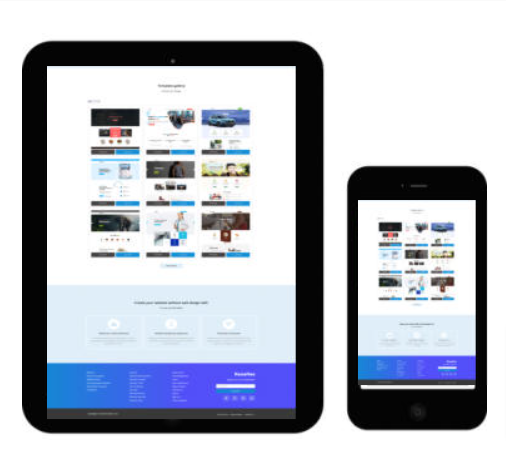

Keasites automatically adapts your website to every screen size — mobile, tablet, and desktop. Every layout is built to load fast, look clean, and provide a smooth browsing experience on any device. No extra plugins, no complicated setup — just a modern, mobile‑ready website from day one.
Site builder gives you complete control over how your website appears on mobile, tablet, and desktop by allowing you to edit each device view independently. You can fine‑tune layouts, adjust spacing and text sizes, reorder sections, or hide elements on specific devices to create a perfectly optimized experience for every visitor. This flexibility ensures your site looks clean, modern, and user‑friendly no matter what screen it’s viewed on.
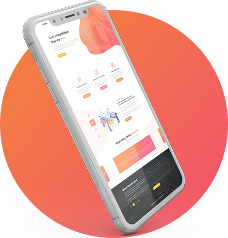
Keasites delivers a mobile experience that feels as smooth as using a modern app. Pages respond instantly to touch, navigation stays simple and accessible, and key actions like calling or messaging are always easy to reach. The layout flows naturally on smaller screens, helping visitors browse comfortably and stay engaged without friction. It’s a mobile‑first approach designed to keep people moving through your site with confidence.
Keasites